A theme named after the decade that gave us daring teen comedies and cutting-edge synth pop was bound to be a crowd-pleaser. And indeed, in the few weeks since Eighties was released, it’s garnered tens of thousands of fans who are using it on their sites.
Eighties may have been created with personal bloggers in mind, but its balance of striking visuals and flexible design makes it a good choice for anyone looking for a memorable, easy-to-customize website. Here are some of the theme’s most noteworthy features, already expertly used by our favorite Eighties early adopters.
A bold header area
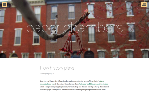
Big and Splash were both huge box-office hits in the 80s. Both can also describe the theme’s header area, a full-width visual statement that draws visitors in immediately. Case in point? paper chambers, a crisply designed site by TC Shillingford, a Philadelphia-based blogger who writes on popular culture, sports, and more. TC’s gorgeous custom header images, along with a slender, modernist custom font, immediately make the site stand out.

Bilbiolkept, a literary blog by Edwin Turner, also recently made the switch to Eighties. The theme complements the site’s thought-provoking content, featuring an ever-changing roster of header images that welcome visitors with fresh visuals every time they stop by.
Tailor-made post formats
Eighties offers several unique stylings for different types of content, including the video, quote, and status post formats. Still on Biblioklept, here’s a great use of the image post format, which gives extra oomph to pictures and photos:

Featured images you can’t miss
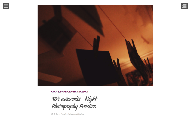
With Eighties, you can create a powerful visual effect when you use the featured images option. Sleepy Coffee and Fables, a photo-heavy blog by a writer passionate about travel and snail mail, displays a well-chosen photo to set a distinct mood on each post.
Here, for example, is the featured image from a post on night photography:
And another one, this time from a post about journaling:

Note that the theme has the option to display full-width featured images, too.
A clean slate
With its ample, bright white space, and endless possibilities to create bespoke designs, Eighties can be turned upside-down: from a recognizably brash theme to one that recedes into the background. A great example of the latter is the professional site of Madeleine Hawks, a doula practicing in Austin, Texas.
From her About page to the Resources page, Madeleine’s site is an exercise in minimalism — but one softened and made welcoming by handmade drawings and a cheerful color palette:
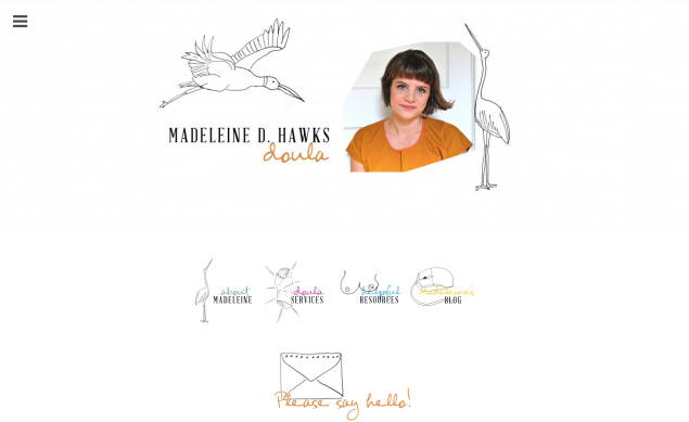
Madeleine has created a website with a static front page, so all of her content — including her contact information — is easy to find for the first-time visitor.
Even more ways to customize
Eighties also lets you tuck away your main navigation with a pop-up custom menu in the header area, and includes a sleek (optional) social links menu. For the designers, illustrators, and other visual artists among you, the theme also supports our Portfolio feature.
Are you using Eighties already? Tell us what it was that made it the right fit for you.
Filed under: Customization, Themes 
![]()