Our default theme this year, Twenty Fifteen, draws visitors’ eyes to what matters most — the text and images you publish on your site. Crisp typography, generous spacing, streamlined navigation: Twenty Fifteen shows that less can indeed be more (and that it can look great on any device).


Keeping things simple and streamlined doesn’t mean you can’t make a theme your own, of course. From free custom color schemes (pictured in the gallery above) to a vertical header area with ample space to channel your (and your site’s) personality, Twenty Fifteen is a theme that invites you to express your creativity. Here are three sites that are doing a superb job using the theme as the canvas for their vision.
Desertification

Desertification is a blog on environmental change, sustainable gardening, and other topics relevant to drylands everywhere. The Belgium-based blogger behind it, Dr. Willem Van Cotthem, crafted a design that matches the topic perfectly: the custom header image shows the harsh beauty of the desert without compromising the readability of the easy-to-navigate custom menu.
The site’s well-selected featured images round out an inviting look that brings to life its fascinating subject matter.
Alfitude
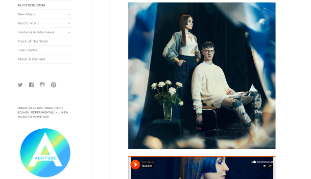
With a perfect balance of minimalism and color, Alfitude, a music blog focusing on emerging artists from Scandinavia (and beyond), exudes effortless cool. A bright white background sets the tone, and custom fonts (available through the WordPress.com Premium upgrade) add a subtle, sleek touch.
Alfie Hanoun, the site’s editor, made sure that finding music on his site is a breeze with a well-designed custom menu. Keeping with the minimalist aesthetic, the only other additions to the sidebar are well-placed links to the site’s social accounts, and an Image Widget featuring the site’s logo.
Michelle Luu
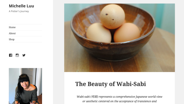
Potter Michelle Luu‘s blog might be just a few weeks old, but you wouldn’t guess it judging by the site’s professional-looking design, which adds a few smart custom touches to Twenty Fifteen‘s out-of-the-box look.
Gorgeous featured images set the tone (and look particularly striking against the theme’s neutral default background). Michelle also added links to her About page and Etsy store, and links to her Facebook, Twitter, and Instagram accounts — all crisply displayed in the uncluttered sidebar. An About.me Widget — featuring an image of Michelle at work on her potter’s wheel — makes the space even more inviting, and imbues it with Michelle’s presence.
Have you seen other great sites using Twenty Fifteen? Have you tried customizing it yet? We’d love to hear from you in the comments.
Filed under: Customization, Design, Themes 
![]()